
Scale Effect and Paint Color
One of the many thing that I encounter on Hyperscale (you know and I know that’s where it is) is discussion about “scale effect.” This is the idea that paint “gets lighter” the further you are from it–or something like that. It’s not a scientific concept, it’s more of an belief system.
And it’s true. Sort of.
I once bought some paint for my house after looking at paint “swatches” at the paint store. I picked out a very, very dark blue. When the paint was mixed up, I took it home and put it on the side of the house.
Shock.
The color on the side of the house was much lighter than the “swatch.” That’s how it looked. But when I took the swatch and put it up to the house–same color. I was just–unbelievable. But the facts were there and I could not dispute them. Somehow, the “dark dark blue” in the paint store on a little swatch became a bright, circus wagon blue on the side of my house. Eventually, I managed to get the paint seller to “darken” the paint enough to make it usable–but it was always a little too blue for my taste.
How did this happen? Well, small samples of paint look much darker than the same paint on the side of a house. That much is obvious. I think. But the simple fact is that there is no “scientific” basis for this phenomenon other than “optical illusion.” So it’s an optical illusion. The paint “looks” darker on the swatch. It’s an “illusion.” It looks darker, but it is not darker. I proved that to myself (the hard way) and I’ll never forget it.
But does this “rule” mean that small models should have “lighter” paint. I’ll answer that by saying that if you don’t understand something scientifically–you don’t understand it. By that I mean that if we are going to “do something” to “correct” the “scale effect” we have to know what we are doing or forget it.
That seems reasonable.
Except, in this case, we can make the argument that “scale effect”–being in the eye of the beholder–is entirely subject to the intuitive “feel” of the painter. In other words, the artist who paints the model can “make the call” on “scale effect” and nobody can prove him or her wrong.
This is my position. “Scale effect” is not a scale effect. It’s part of the indefinable “something” that adds to (or takes away from) the realism of the model. It should influence the painter only when said painter “understands” what he or she is doing–intuitively. Only when the painter actually feels the need to make a change in the paint should said painter actually make any such change. It has to be the result of an interpretation by the painter–because ONLY the painter can see what the flick he’s talking about. If the painter sees a “lighter” color–then it is entirely within the bounds of artistic license to lighten the color IF it results in a “better” outcome.
Is this shade of Sky too “dark?”
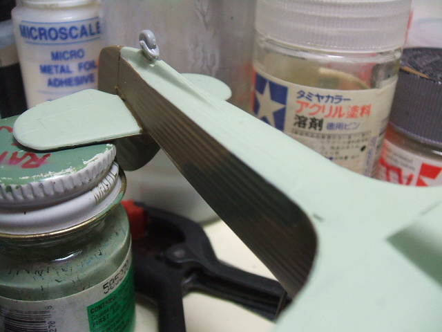
Not to me. It passes my sniff test, so it’s good to go. You may feel that it needs to be “lightened” so go ahead. But if you say that “scale effect” is a RULE and can be calculated, then I have one question for you:
What color is this dress?
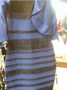
The dress is white and gold, and unless it is my monitor/camera flash, that sky looks too light!
haha.
Don’t you love personal perception?
Yah scale effect is subjective. As is all perception of color. Your paint chip boing was just what I needed.
I think small scale 1:72 etc can benefit from brightness. It makes them easier to see, see?
Savvy swabby!?
I still think there’s a woman in that dress.