
Hellcat Part 2
I was posting my “Gallery II” post when a thought struck me (and almost knocked me down I’m so sensitive).
Why do I ALWAYS give so much undue credit to the kit maker? The kit maker didn’t make the model, I did. I’m going to make a point of not ALWAYS referring to the kit maker as if they “owned” the model and I’m just the stooge who unwrapped it and did a Pewdiepie impersonation. From now on, I’ll mention the kit maker the same way I’d mention the brand of ketchup used in a recipe.
Meanwhile, on with the Hellcat!
I started out putting one coat of paint on the inside parts. It didn’t look too good and the photos came out blurry, so we’ll move one. A few coats later I glued the major parts together and BOOM. A Hellcat.
Now comes the fun part. PAINTING!
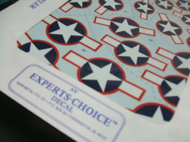
Step one is gather together the stuff needed to replicate this scheme. I need some national insignia with red outlines, and fortunately I have a sheet of these I’ve been saving for something like this.
I’m also going to get to use my favorite sheet of Navy instrument panels and seat-belt decals.
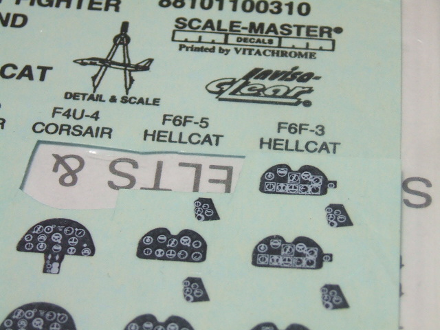
I don’t have any time or interest in making teensy seat-belts or sandwiching instrument panels together when I can just use a decal. I mean, come on!
I also need the paint. That’s not so easy. I just happen to have mixed up some colors to match the “factory fresh” three-color U.S. Navy camouflage from early in the war. It didn’t last too long, it’s been the subject of much controversy, and it’s probably just a minor footnote in history compared to the big picture, but here we are right up to our boot tops in the middle of it.
I mixed the colors to match the “freshest” examples I could find in Kodachrome images.
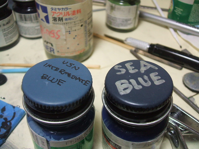
That’s right. It’s pretty intense. It’s caused untold amounts of conflict between otherwise merely cranky old men who should know better. But that “Intermediate Blue” is vivid and dark, and that “Sea Blue” is very, very dark.
I think that one of the reasons that there has been so much argument over this is this unfortunate color chart, which I took a photo of just for purposes of discussing that I’m right.
 \
\
This came from a book entitled United States Camouflage WWII by a fellow named Frank Dial of the IPMS. This was a very, very standard reference for ye olden days (the 1960’s) and includes this “official” chart.
The intermediate blue is the right color but way too light. The blue gray is the right color but too dark. I’ll bet this single reference has caused more nasty purse-swinging, face slapping fights that any other single source of mis-information in the history of plastic gluing as an art-form. Compare this to my color mixes, because later we are going to be comparing the finished model to the Kodachrome of the snappy new navy hellcat over Palmdale or wherever it is.